
This article contains excerpts from Michael Giaimo’s lecture at The Hilbert, with some text by our Disney History 101 correspondent.

In recent years, the work of the late Eyvind Earle has gained much appreciation among scenic aficionados and Disney art fans alike! Eyvind Earle Trust has collaborated with numerous galleries and museums in order to present collections of his work for public viewing. Eyvind’s very aesthetic continues to influence the works of other artists, including the artistic style of the highest grossing animated film of all time! Michael Giaimo (Art Director, Production Designer - Walt Disney Studios) explains the impact that Eyvind had on his own art direction over various projects for Walt Disney Studios like Frozen (2013), and the upcoming Disney Animation release Frozen 2 (2019).

A demonstration of Eyvind Earle’s “jewel-like” colors - “Ancient Forest”, “Mist in The Dark Woods”, “Empty Kingdom”, and “Waves of Golden Fire”. Some images may be subject to copyright.
“EYVIND’S AESTHETIC”
“Eyvind’s work was very formal. Most of his compositions were about horizontal and vertical planes. He’s extremely shape oriented. He has these incredibly strong shapes and then elaborate detail and strong silhouettes, which he uses to create a growth of trees or a castle on a mountaintop, and a strong geometric shape holding it all together.”
“Eyvind created jewel-like colors and he was talented at pulling and massaging analogous colors together. Oranges and greens, cool greens and dark greens side-by-side. Nothing casual about his work at all. Sleeping Beauty is a pageant.”
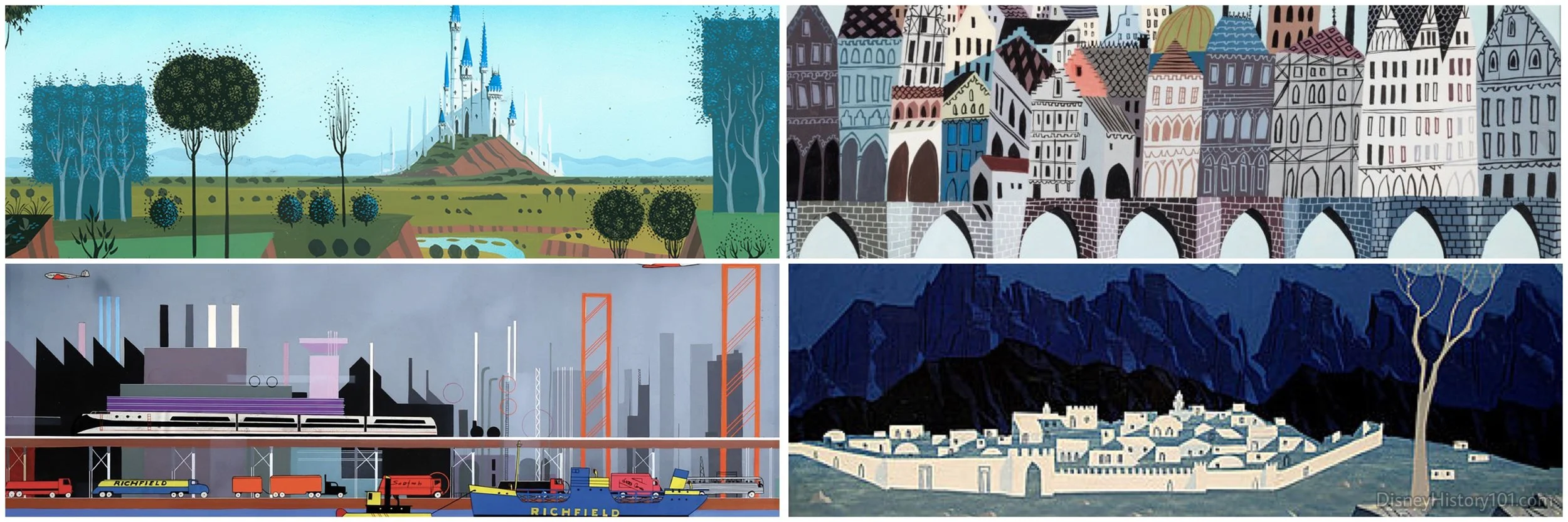
NO ONE LIVES HERE - Even Eyvind’s backgrounds produced for various features are devoid of people! (Clockwise from upper-left) “Sleeping Beauty”, London Bridge segment of “The Truth About Mother Goose”, “The Story of Christmas”, and “The World Beneath Us”
“There is a sort of peacefulness to his work, and that is what draws you into it. Nature seems to have been a place of comfort for Eyvind and seemed to take over in his life. That is what Eyvind shares with us. Eyvind’s work may be called elegant, sublime, beautiful, and meticulous, but never joyful. It’s colorful, and yet a bit of melancholy hangs over it. There is a certain quiet to his work. No one really walks through it. It is exquisite, but quiet. Pulling you in, and pushing you away at the same time - keeping you at an arm’s distance.”

Eyvind’s color studies and thumbnail story scenes showcasing his figural icons.
Sleeping Beauty’s character designs accompanying Eyvind’s work were vertical, and had vertical planes running throughout them. Some artists found it restrictive, but others like Milt Kahl and Marc Davis would embrace his style. “When Eyvind paints figures, he doesn’t paint people. He paints icons - like statues. There’s a reason for this.”
“THE EMPTY KINGDOM of A LONELY SOUL”
In order to understand the aesthetic of Eyvind’s personal work, as well as his countless contributions toward Walt Disney Studios’ features and short films, one must understand Eyvind Earle - the man. Yes, tucked behind the groves of trees lies a deeply layered back story - one of disappointment, loss, and tragedy.
Eyvind had a very tough childhood. Eyvind was born in New York (in 1916), but his family moved to Hollywood in 1918. Though Eyvind grew up during the depression era, his father (an artist) came from a wealthy background. Eyvind’s mother was the fourth wife of Eyvind’s father, and from all existing accounts, it seems that Eyvind’s father was difficult to live with. He was perhaps (what some may call), mentally abusive to Eyvind.
One day, he took Eyvind along with him on a holiday to Palm Springs and never returned to his wife. While Eyvind lived with his father, he was given an ultimatum - read 50 pages of a book each day, or produce a piece of artwork. It was at the age of ten, that Eyvind recollected a paint brush was first put in his hand.
Eyvind had an older brother (whom he did not know), because he died swiftly as a result of polio, when Eyvind was just 1 1/2 years old. Eventually Eyvind too contracted polio, and the result was that half of his face was left paralyzed. Eyvind was always self conscious about this, even around the studio.
All of these events and experiences translated themselves into Eyvind’s work in some way or form. Eyvind Earle’s art has much mystery to it. You want to wander into his forest, and (as you’re doing so) you may wonder what’s beyond that grove of trees. It helps us understand the mystery that we all are. His work has many, many, layers. It’s not just “surface art”.
“After Walt Disney’s Sleeping Beauty, Eyvind Earle might have stayed on, but some were not kind to him. There is a “Disney house style” and then there are stylists that come to Walt Disney Studios (like Eyvind Earle). Some (like Marc Davis and Milt Kahl) championed his style, but some did not embrace his style. When Eyvind left, he was one of the very talented and prolific few who managed to go on and build a fine art career. Walt Peregoy (an incredible artist), always wanted to have the career that Eyvind did, but wasn’t able to. Eyvind established his own animation studio, and even produced a feature film about Christmas. It was beautiful.”
“CARRYING THE VISUAL LEGACY OF EYVIND EARLE”
“I was about five years old when Sleeping Beauty was released, in fact it’s the first film I remember. As a young boy and as a teenager, it had real staying power for me. I knew that it was something special, and yet I had no idea how his work would influence my own at Walt Disney Studios.
“POCHAHONTAS - PAINTING WITH ALL THE COLORS OF THE WIND”
The writers saw Pocahontas as a “quasi-sideways-’West Side Story’” version of Pocahontas. I did some design pieces for them, and they liked my work, and told me that they would love me to direct the art for the film.
“I was attracted to the project, and happy to work on something different. Pocahontas was sort of a ‘tone poem’. There were no ‘yucks’ (that were common in previous features), and few contemporary references in the film. It was certainly true to it’s own self. The backgrounds of Walt Disney Animation’s previous release The Lion King, had this quasi-naturalistic fantasy feel to the settings. As for the artistic direction of Pocahontas, I decided that I would honor the narrative. I would not create something that goes against it - I would support the narrative.”
“We took some research trips to Virginia, and after observing the flat planes and Virginia pines, I suggested that the Eyvind Earle aesthetic was the way to go. The cool and the warm temperatures against each other. Like Eyvind, I was not afraid to use black in our characters. I gave our villain Governor Ratcliffe a palate that was very unnatural to the forest, because he was the intruder. An unnatural color palate heightened the tension in the situation…Katzenberg wasn’t to happy about Pocahontas’ palate, and made comments about wanting more shadows. Mike Gabriel and Eric Goldberg championed the palate. (As a side note, Katzenberg left a month or two later). I wouldn’t be here without Mike and Eric. You certainly need your champions.”
“There was no interaction between the villain of the story (Ratcliffe) and the heroine (Pocahontas), and a slight loss of dynamic due to that. At one point, they played with the idea of Pocahontas getting captured (which would have allowed for this interaction). If that would have worked, I would have liked to see that.”
“There was never another artist that was given so much liberty to create a look of a feature film like Eyvind was given for production of Sleeping Beauty.” About the period spanning production of Pocahontas, Michael relates, “We were never given the similar time span and financial situation to produce a film like Sleeping Beauty.” But, similar to Sleeping Beauty, “all the time, work, and labor shows on the screen. It (Pocahontas) was really a labor of love.”

You can see the E.E. influence in Michael Giaimo’s work (top).
“THE COOL AND WARM PALATE OF FROZEN”
“When you start working on a film, you don’t need to know where you’re going. You really have to feel your way around it. I came back to Walt Disney Studios in 2009 when a 2-D hand-drawn project entitled The Snow Queen was in production. Tangled wasn’t to be released until 2010.”
Two weeks after I arrived, they suddenly ‘shelved’ The Snow Queen. The reason for this, was that The Princess and the Frog had come out, but wasn’t as successful in the box office as they had hoped. There were some that believed 2-D animation was no longer viable. The then head of the studio questioned whether we should continue producing ‘fairy tales’. I was not around for Beauty and the Beast and The Little Mermaid. I ‘missed the boat’ and wondered if I would ever work on a bona fide Disney fairy tale.”
“With the success of Tangled, The Snow Queen was brought back. The question of whether it should be produced using hand-drawn animation was reconsidered…but they decided to make The Snow Queen a CG film.”
“The story of Frozen was not anywhere near the original. We first envisioned a charming and lighthearted film, but it did not resonate with the audience. After the presentation, we went home and returned with three very different story ideas. Ultimately, it was decided that Frozen was to be a ‘sister story’.”
“Pinocchio took place in the Northern Swiss Alps, and Sleeping Beauty had a proto-renaissance-Gothic feel to it’s settings. Visually, a lot of development had been done on The Snow Queen before all this. Considering where Hans Christian Andersen lived, I was looking at all things Scandinavian (and other locations from there to Russia). The fjords were something that we thought we could use, that hadn’t been done before in a Walt Disney animated feature.”
“That’s when the Eyvind Earle horizontals and verticals came back into play, but in a CG way.”

“Another thing I loved about Norway were the stave churches. I thought they were something unique. We applied Eyvind’s aesthetic to the steeples, squeezing them all the way to a pinpoint. Notice the castle and how we pushed those shapes, in addition to the decorative details.”
“To put the castle at the bottom of the fjord (as opposed to the top of a mountain), would be so incredibly dramatic. I’m glad that the rest of the art department went along with it.”
“In 2D it was easier to create instant graphics that read graphically, but with CG the camera is moving more. The exquisite and raw color palate was influenced and affected by the camera and lighting movement. Still, I came to embrace the CG world. Johnn Lasseter taught me that CG feature animation is a hybrid of live action and animation - you have to study both. I love 2D artitsts like Eyvind Earle and Walt Peregoy, but I also look to direction and production of live action films.”

“Again, horizontals and verticals came to play within our character designs - all of their pleats and folds, as well as the use of triangles became part of their composition. In early concepts, Anna was a saturated icon against the cool palate of Elsa and the snow palace.”
“We also studied snow flakes (their six-sided, diverse array), with college professors giving us presentations. We had research trips, which helps us to incorporated the snow flake into the columns of the ice palace. The back of Elsa’s cape has six sides - like a snowflake.”
“Last year we released a 22-minute short film. I wanted to create a “costume movie”. We did our best to create complex outfits for a CG world - spending months , even a year to create these costumes. For the special, we created two new outfits for Anna and Elsa. We created color palate that connects them (now that they’re sisters). This new palate pulls them together. We then created emblems like the ‘goat’ and ‘Yule bell’, as well as a special holiday palate for Arendelle. We took all those details and decorated the castle with them!”
Michael never officially met Eyvind Earle (though he had been in his presence several times). Still, Michael’s praises and respect for the artwork of the late master Eyvind Earle run high, like the Norweigan fjords that grace his Frozen backgrounds!
The Eyvind Earle influence doesn’t stop with the Art Direction of the feature films. “Half of my job is being responsible for consumer products, walk around costumes in the parks, and other things associated with the visual look of the franchise. It’s kind of interesting - you’re always looking for new ways to showcase these characters.”
“I like to think that Disney ‘owns’ animation in a way - a unique hundred-year-old legacy. The unique thing about working for Disney is belonging that legacy, which includes Eyvind Earle, Fred Moore, Glen Keane and so many others! I have always tried to bring what I loved about 2D animation, into the world of CG animation. In incorporating the styles and aesthetic of ones like Eyvind Earle into projects we were working on, I was bowing to their color palate, style, and arrangement.”

Here, Michael took time to answer a few questions of budding animation students, and autograph their Art of Frozen hard copies!

Michael Giaimo’s lecture on Eyvind’s influential aesthetic was so enjoyably thorough, that the audience was briefly left speechless before a rousing applause. After the presentation, it was permissible to take pictures, and Michael was eager to meet all of the animation students, fine art aesthetes, and general Walt Disney animation fans. We stayed until the very end, and watched as he kindly, and warmly took time for each and every person in attendance! Bravo!
We look forward to more Disney-related lectures and presentations at the Hilbert Museum of California Art! For more information about upcoming events, feel free to visit : hilbertmuseum.com
THE HILBERT MUSEUM OF CALIFORNIA ART
167 N. ATCHISON STREET
ORANGE, CA 92866
(714) 516-5880
TUESDAY - SATURDAY, 11am - 5pm
SUNDAY and MONDAY, Closed


Quisque iaculis facilisis lacinia. Mauris euismod pellentesque tellus sit amet mollis.